

.png)
Shifting to an app-first product
How did I take features away from people who just subscribed, and get more of them to convert?
Mob is a subscription-based recipe and meal planning product, available on both web and app, with the app offering a much richer experience. With the website as our main acquisition source, most new subscribers were starting on web. The company wanted to validate an app-first product strategy and reduce its dependence on the web product.
We used the existing website as a transitional state and ran an experiment to validate the strategy quickly, instead of building a new website first. New subscribers were guided clearly to the app, with the experience framed around what they’d gain, not what they’d lose.
We wanted to find out whether moving new users to the app would work, but a rebuild would have taken months before we got any signal. Working closely with engineers, I knew what the existing site could realistically support, so I proposed using it as a transitional state and running the change as an A/B test.
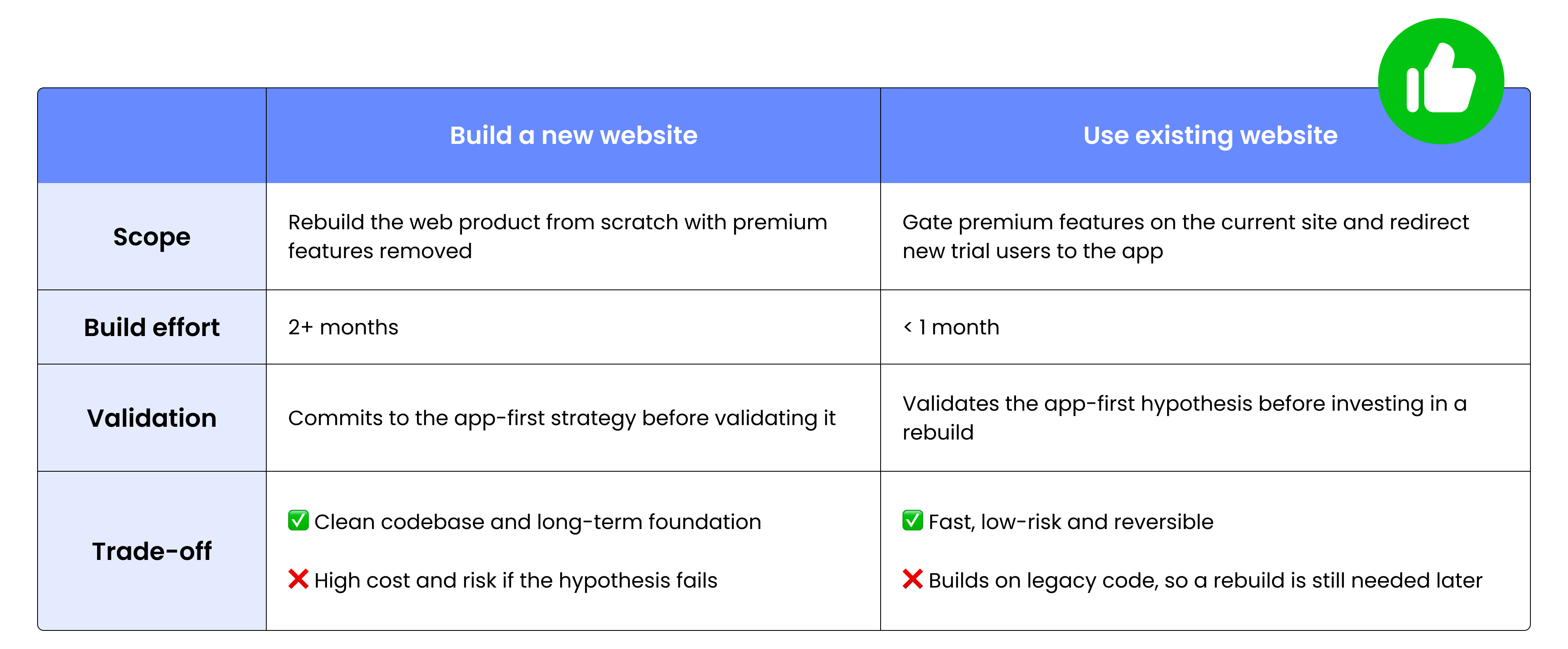
Gate premium features on website could have put trial starts at risk, so I kept everything up to and including the paywall unchanged. That protected trial starts if the idea didn’t work, and meant any change in results came from the post-signup experience.
I reviewed trial conversion data and mapped the journey from web signup to first app session. Users who used both web and app on their first day converted to paying customers at 2.4× the rate of web-only users, which suggested the app is where people see Mob’s value. Yet we left users to find the app on their own.This evidence showed we needed to get users into the app on day one, while they’re most motivated.
.png)
.png)
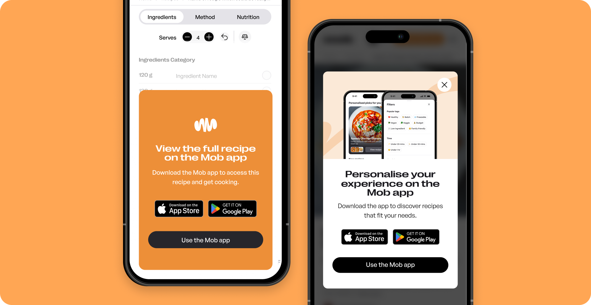
Taking features away on web could easily feel like a downgrade, especially for users who had just paid. So instead of telling users what they couldn’t do on web, the download page and prompts focused on what they’d gain in the app.
.png)
Working with the customer support and retention teams early surfaced a key constraint: web and app subscriptions run on separate payment systems. That meant users who subscribed on web had to be able to manage and cancel their billing there easily.
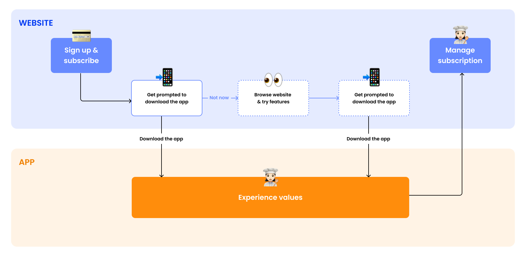
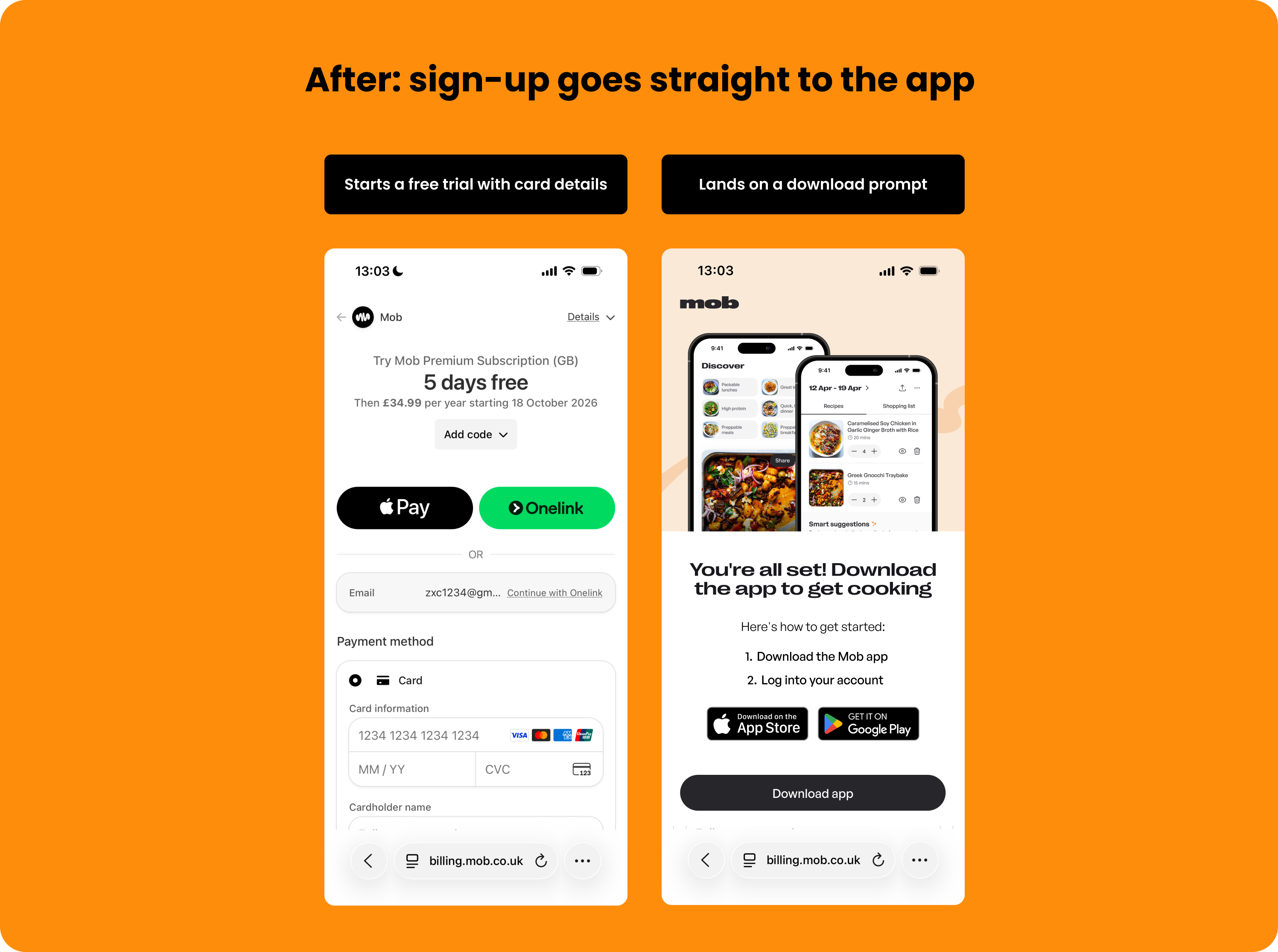
After starting their trial on the website, users land on a dedicated page with a single action: download the app. There is no option to continue on web, which removes the choice that would otherwise split users across two products.
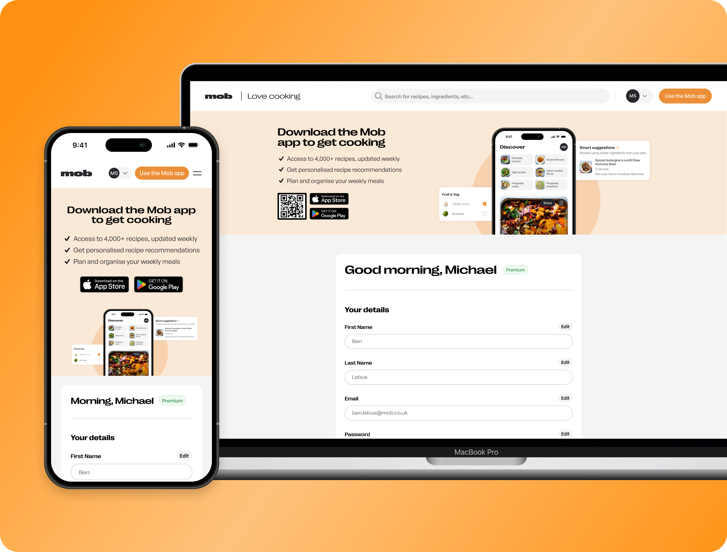
Every web feature is gated except subscription management. It stays where users paid and expect to find it, which protects trust and avoids support issues.
When a user tries a feature on web, the prompt matches that action and shows how the app does it better. Users get one relevant reason at the moment it matters, rather than a list of rules.
More users reached the full product early in their trial, instead of staying in the limited web version.
Instead of costing conversion, the redirect to app improved it because users expereince more value.
Working closely with engineers helped me understand how our web product was built and what was realistic to change. It’s a habit I want to keep: the better I understand how things are built, the better I can spot simpler ways to solve a problem.
It’s tempting to jump straight into building the obvious solution. This project taught me to pause and ask first: what do we actually need to find out? Often, there’s a smaller, quicker way to get that answer. That’s a habit I’ll keep: make sure a solution solves the real problem before investing in it.
.png)


